Ideas that go beyond logic are born from meetings that are different from usual.
A beloved shochu cannot be created solely within a company meeting room.
Unraveling the secrets behind product development: the "Flavor Meeting."
Kirishima Shuzo has a meeting called the "Flavor Meeting." It's an important meeting that is mainly held when creating new products or other items.
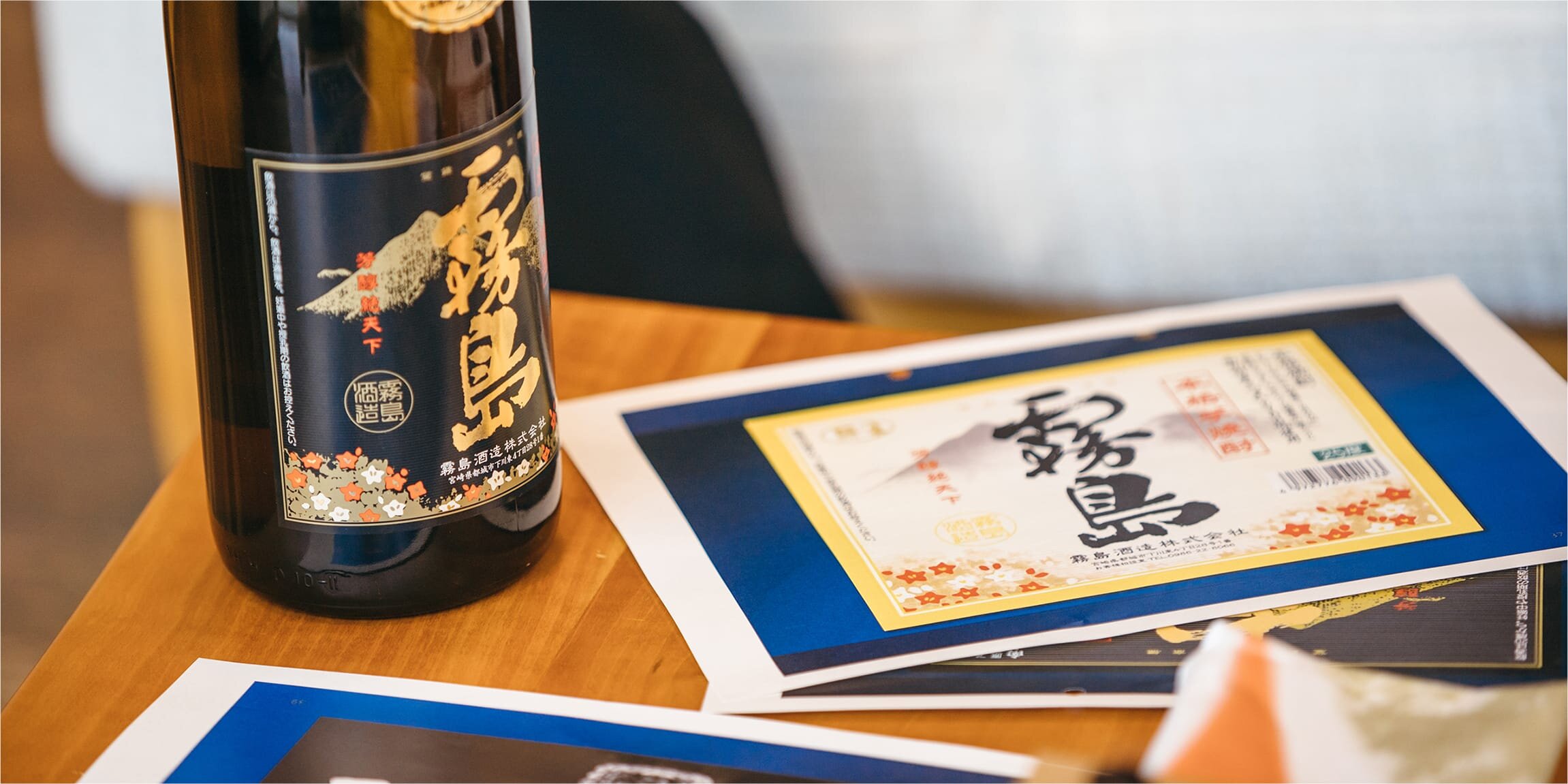
Torafu Kirishima, with its distinctive label design that sets it apart from the rest of the Kirishima shochu lineup, was also born from this Flavor Meeting. We spoke to Riho Yamamoto of the Planning Office, who was involved in the development, to find out what kind of discussions led to the creation of Torafu Kirishima, which incorporates a tiger's face motif on its label.
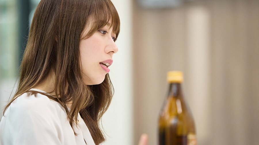
Yamamoto joined the development of Torafu Kirishima midway through the project. When she took over, it was already decided that they would create shochu using a combination of yellow and black koji. In addition, it was highly likely that the name Torafu Kirishima would be derived from associating the color of the koji with the powerful tiger pattern.
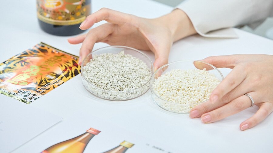
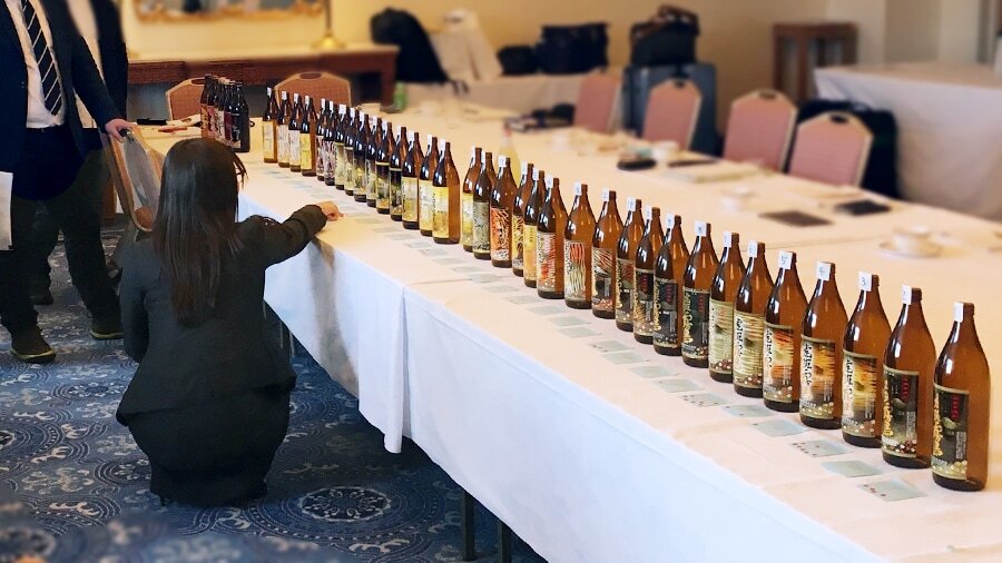
The "Flavor Meeting" is primarily held outside the company premises. Although the name includes the word "flavor," the discussions involve not only flavors but also many topics related to presentation, such as label design and taglines. The name was coined by Managing Director Takuzo Enatsu, who values creating an environment where ideas can easily flow.
"It's important to have that feeling you get when you go to a nice restaurant and your posture straightens up, making you want to carefully examine the interior and decorations," Yamamoto says. She adds that, depending on the venue, designs and objects that reflect the local climate and culture are often on display, and they draw inspiration from these as well.
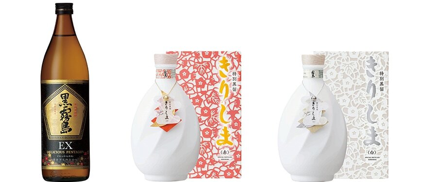
For example, consider the label development for "Kuro Kirishima EX." The current pentagonal design was inspired by the hotel that hosted the Flavor Meeting held on Yakushima Island. The hotel's shape, which happened to be a polygon, was so beautiful that it resonated with all the participants, and it was decided to incorporate it into the design. One could say that they drew power from Yakushima. In the case of "Tokubetsu Joryu Kirishima," the meeting was held in Naruto. Inspired by the whirlpools seen during a drive across the Naruto Strait, the design features a swirling pattern on a pure white bottle.
While Torafu Kirishima has undergone five such "Flavor Meetings," the design, which is based on a tiger's face, came up unexpectedly at the very first meeting.
"The participants voted for the design proposals, and I remember that moment very clearly. It wasn't about any particular reason; I just voted for the tiger face design based on intuition."
It didn't receive a particularly large number of votes, but they decided to keep that design until the very end.
"I don't think I would have chosen it in a regular meeting room. Even if I had, I think I would have been met with calm opinions from those around me and decided against it... I'm glad it was in a Flavor Meeting," Yamamoto recalls.

Although she wanted to find a way to incorporate the tiger-face design, Yamamoto felt a sense of anxiety. It was too unconventional a direction for a Kirishima Shuzo product label. Would it be accepted by fans of Kirishima shochu? Would it convey the appeal of the product? Would it be approved within the company? To alleviate her anxieties, she desperately wanted to find a breakthrough.
"With the advice of the managing director, I spent that time researching tigers," Yamamoto laughs.
What was the most important thing to convey on the label? When she thought about it, she arrived at the flavor profile of Torafu Kirishima.
Torafu Kirishima is characterized by its soft, gentle sweetness derived from yellow koji. Wondering if she could express that characteristic through design, she even researched different species of tigers.
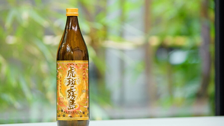
And that's how she arrived at the "Amur tiger." Compared to other tigers, Amur tigers live in cold climates and have fluffy fur. By incorporating that image into the design, the black lines of the tiger's pattern became softer, the expression became gentler, and it became a more suitable label for Torafu Kirishima.
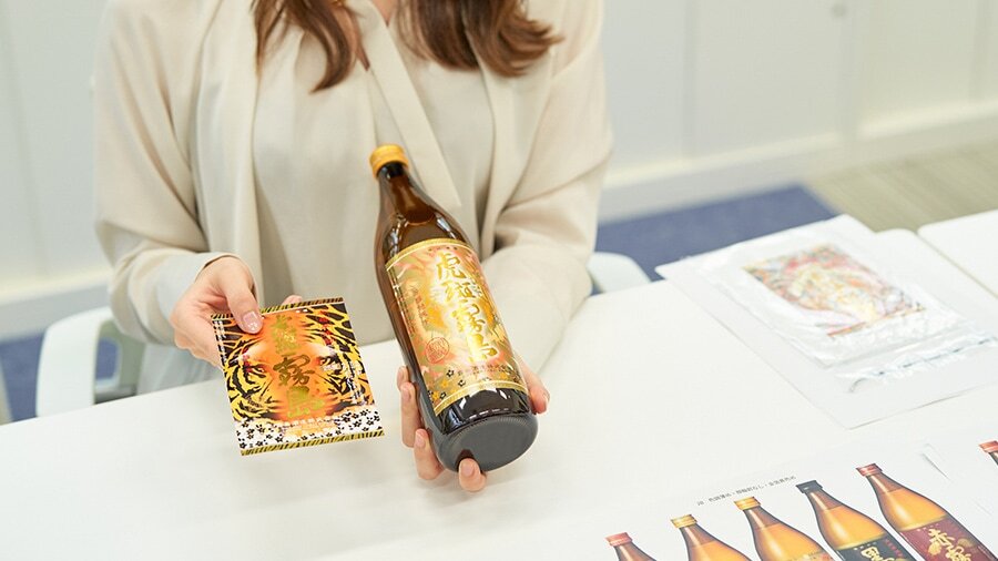
After repeated deliberation, the design for Torafu Kirishima—which features the tiger’s face prominently—was finalized. Customers who have purchased it have responded warmly.
"We've received comments like, 'I bought it just because I liked the cover art,' and 'We'd love to see original merchandise made with this label design,' and it makes me feel like it was worth taking on this challenge," says Yamamoto.
This label, which expresses the flavor in the most innovative way possible, is what drives this product.
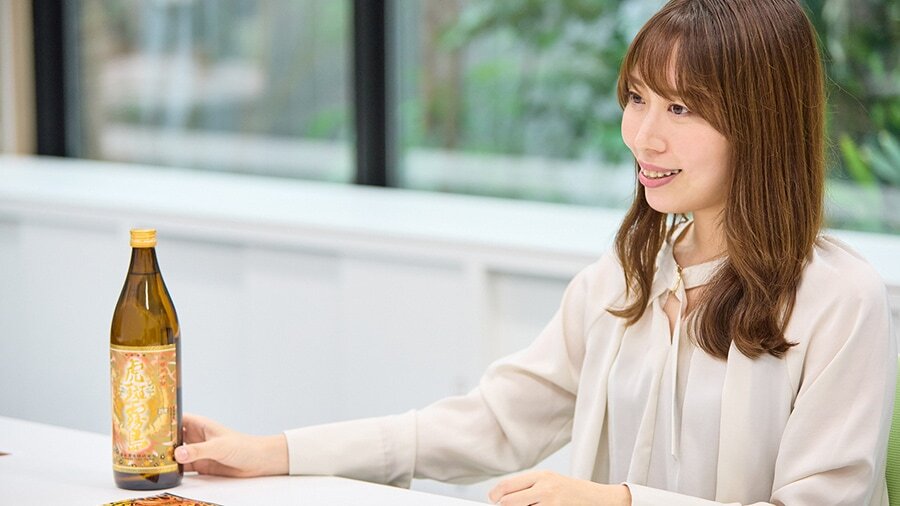
As development progressed, the managing director told Yamamoto, "It might seem like we're fooling around by diligently exploring the delicate details. But don't worry, there will be people who appreciate it and understand it." These words gave Yamamoto the encouragement she needed. She also realized that the existence of the Flavor Meetings played a crucial role in bringing together the participants' subjective opinions in a positive direction.
"In an era where efficiency is prioritized, holding a 'Flavor Meeting' outside the office, starting with setting up the meeting itself, is incredibly challenging. Nevertheless, I believe there are feelings that can only be gained through a 'Flavor Meeting,' and things that can only be achieved through such meetings. That's why I want to explore new ways of conducting 'Flavor Meetings' while adapting to the current times," Yamamoto said.
They create things that captivate people beyond logic. The source of their bold yet refined product appeal must lie in their Flavor Meetings.



*Please refrain from sharing alcohol-related information with those under 20 years old.

- From hashtags
Interesting articlesSearch for